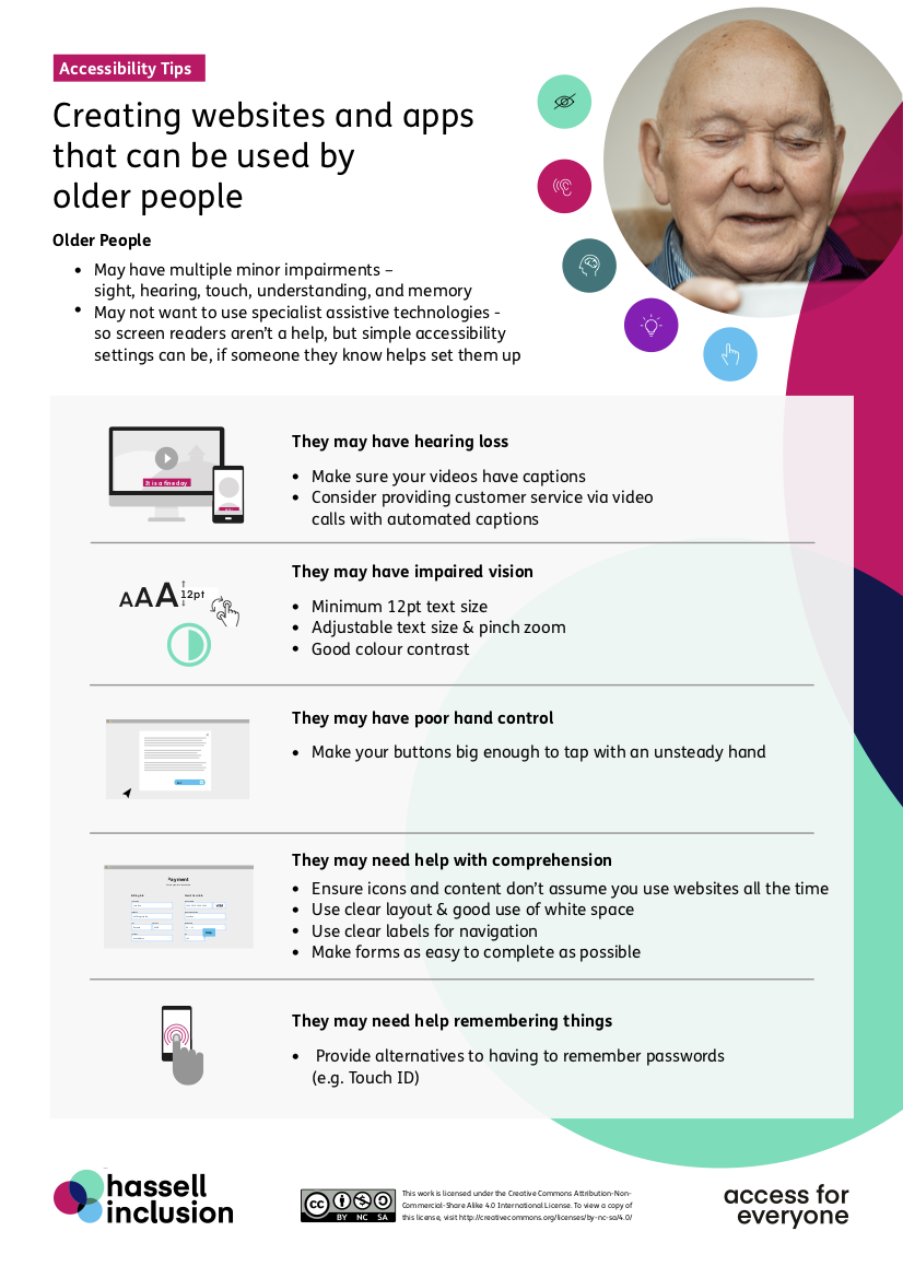
Originally developed for UN International Day of Older Persons 2020 Dos and don’ts on designing for older people (POSTER)

Older people could be your web site or app’s most underserved audience.
Turn them into customers with tips from our Digital Accessibility Experts Live webinar last week on the importance of digital accessibility to people who are ageing.
Why it’s important – my mum…
Everyone’s got a funny tech story to tell about their parents. I’ve many. But, when Covid hit, to help my mum and dad out, I sent them their first online grocery shop.
Being an independent type, once my mum got over not being able to choose the veg herself, she decided she wanted to do the online shop herself!
 She decided on Tesco’s who she’s shopped with for years, and then proceeded to spend 3 hours (yes, 3 hours!) with one of the most patient people in the world on their call centre, who talked her through the process from sign up to check out. What amazing customer retention and care!
I don’t think Tesco’s is necessarily any worse or better than any of the other online shopping services out there, but what I do know is that it cost them quite a lot of money to retain my 80 year-old mum as a customer.
Putting on my accessibility hat, my view is that my mum and many older people like her want to, and should be able to, do their online shop without a 3-hour call to customer services.
So here’s a poster with hints and tips to help people like my mum, or yours…
The poster
Lots of people really like the accessibility do’s and don’ts posters from gov.uk on the accessibility needs of the 20% of the population who have various different disabilities.
But there wasn’t one for people who are ageing – who make up another 20% of the population.
So, for UN International Day of Older Persons 2020, we wanted to share a poster which summarises some of the key things we’ve learned in our user research with older people, so you can consider them when you’re creating websites and apps.
Here’s an image of the poster. It has a brief alt-text summary. Click here for the full text of the poster.

Download the poster
Here’s the PDF download of the poster.
We’d suggest you print it off and put it somewhere in your team space to remember this 20% of your users who may be very different from you…
Feel free to share it freely with anyone who you think would appreciate it. Like the gov.uk posters, we’ve made it available under a Creative Commons license which allows everyone to share, use and build upon the poster provided is is used non-commercially and keep the appropriate attributions (Hassell Inclusion and Creative Commons logos).
Want more?
If you’re interested in hearing more about the needs of people who are ageing:
- Check out my video interview with Andrew Arch, who led the WAI-AGE work at the W3C Web Accessibility Initiative on the link between accessibility standards and ageing, in our blog Boomers are the largest generation in history – so how do you make sure they can use your website?
- Learn more directly in one of our ‘Speed Dating’ sessions which enables your staff to learn how older people and those with disabilities use sites and apps, and the technologies they use them with, by speaking directly with people with those conditions.
- Sign-up for the Hassell Inclusion newsletter to get more insights like this in your email every month.
Transcript of the text on the poster
Older people:
- May have multiple minor impairments – sight, hearing, touch, understanding, and memory
- May not want to use technologies their children don’t use – so screen readers aren’t a help, but simple accessibility settings can be, if people are supported in setting them up
They may have hearing loss:
- Make sure your videos have captions
- Consider providing customer service via video calls with automated captions
They may have impaired vision:
- Minimum 12pt text size
- Adjustable text size & pinch zoom
- Good colour contrast
They may have poor hand control:
- Make your buttons big enough to tap with an unsteady hand
They may need help with comprehension:
- Ensure icons and content don’t assume you use websites all the time
- Use clear layout & good use of white space
- Use clear labels for navigation
- Make forms as easy to complete as possible
They may need help remembering things:
- Provide alternatives to having to remember passwords (e.g. Touch ID)
