The importance of text accessibility: how IBM’s Content Clarifier shows us what we’ve forgotten
“If you care about being thought credible and intelligent, do not use complex language where simpler language can do.” Daniel Kahneman, Thinking Fast & Slow (winner of the Nobel Prize)
Back in 2001, when I first started working in accessibility at the BBC, one of the key things we thought about was the aim to make text as simple as possible. Using Plain Language. Writing designed to ensure the reader understands as quickly, easily and completely as possible. In the Accessibility Guidelines at the time, WCAG 1.0, this was a single-A requirement, recognising it as one of the most important aspects of web accessibility. Accessibility experts and our users agreed that how we used words on our websites was massively important.
The challenge then was how we could make our more educational sites and those written for audiences with their own slang in simpler language. How do you do Shakespeare in Plain Language? How do you do Black Urban Culture in Plain language? And would either of those make sense?
How we forgot the importance of text accessibility
Fast forwards to 2009, when WCAG 2.0 replaced 1.0, and a curious thing happened. The importance of making web sites understandable through Plain Language dropped from level A to level AAA. For those of you who aren’t in the know, A is what everyone feels like they have to do, AAA is what everyone forgets.
The authors of WCAG 2.0 did this because they could not find a way to objectively test whether a page uses the clearest and simplest language. However, in making the change, the Guidelines now effectively said that making sure people could understand the words you write was less important than making sure screen readers could pronounce those words correctly. Which, when you think about it, doesn’t make much sense. There were some voices of concern, but they were quickly forgotten.
Fast forwards again to July 2018, in London, where I’d been invited to speak on accessibility at the Copy Forum of one of our clients. I had the chance to see what WCAG’s decision had done to the relationship between content authors and accessibility experts. Due to that decision in WCAG 2.0, you don’t really hear people talking about the accessibility of text content often. Just a few talks from people like Ashley Bischcoff at TechAccessOK 2018, or my own interview with Karen Mardahl on BS 8878 and Technical Communication back in 2012. The huge communities of content marketers and copywriters, of people who craft words rather than images or code, have been completely forgotten by the accessibility world.
At the Copy Forum, they’d invited me to tell them what they could learn from accessibility. I was there to tell them that there was a lot that accessibility could re-learn from them.
I said this because, if you look at WCAG 2.0, you’d be forgiven for thinking that words don’t matter. That’s a real problem, as a large part of most websites is text. And lots of groups of people with impairments really benefit from text accessibility:
- People who are blind, want text to be as short as possible & structured well
- People whose first language is not the native language (including sign language users), want text to use the simplest language
- People with learning difficulties, want text to be as simple as possible (ideally in Easy Read)
- People with ADHD, want text to be as brief as possible, in bulleted lists
The good news is that WCAG may now be revisiting its 2009 decision, as the accessibility of text is likely to be addressed by its new Cognitive and Learning Disabilities Accessibility Task Force. You can take part in the Task Force if this is a topic that means a lot to you.
But, in the meantime, how do we remember what is important about the accessibility of words?
How Content Clarifier lays out the requirements we forgot
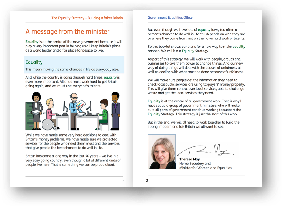
Here, the creation of IBM’s Content Clarifier in 2016 really helps. This tool is based on the idea that much of the text on the web is too complicated or long for some people to read as it is. It takes some of the requirements that different groups of people with disabilities have of text, and tries to alter text to fit those requirements.
If you like, it’s an assistive technology that operates on text rather than images or buttons.
So let’s look at what Content Clarifier can do, as an indication of those requirements:
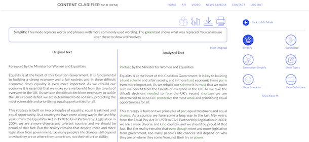
Simplify – replacing complex words with simpler ones

Summarize – cutting out any ‘unnecessary’ parts of the article

Show topics – enriching topics in the article with links to additional information
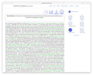
Show definitions – addition of definitions for difficult words
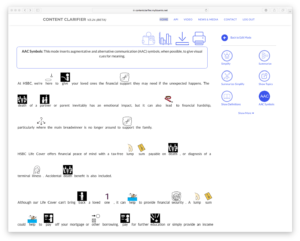
AAC symbols – addition of symbols to help people who use them for literacy support
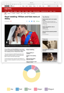
Show emotions – summarises the emotions in the text
 |
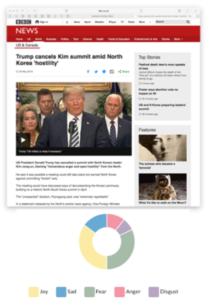 |
A royal wedding article and an article titled ‘Trump cancels Kim summit amid North Korea ‘Hostility’ through Content Clarifier’s ‘Show emotions’ option. This shows a high amount of joy in the royal wedding article, and a high amount of fear in the Korea article.
Does it make sense to rely on a tool to fix what you could have fixed yourself?
Unfortunately, a bit of experimentation with Content Clarifier reveals 3 things:
- Many people need online text to be altered to fit their needs. Showing Content Clarifier’s addition of symbols to text for those who benefit from them as a support for their reading, could really help people with learning difficulties. And its attempt to extract the emotions in articles for people who might have difficulty recognising them, is potentially useful for those on the autistic spectrum. These are the start of potentially valuable Assistive Technologies for groups who are often forgotten.
- However, even with great advances in Machine Learning and Artificial Intelligence, getting a computer to make a passage of text shorter or simpler, and not lose its meaning, after that text has been written is very difficult. Some things work well, like replacing complex words with simple ones. Other things are unreliable, such as generating automatic summaries of text. And these have most trouble on exactly the sorts of text people really need to be simpler, such as financial terms and conditions. Anyone relying on an automatic summary of these documents today could end up with the wrong credit card, mortgage or insurance.
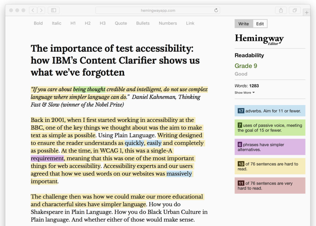
I’m sure this will improve, with time. Content Clarifier is only a beta at the moment. And I’d certainly encourage you to check out the tool to see what it can currently do. But for now a better of use of A.I. is to help point out where our text could be better written, so we can fix it ourselves before publication. Tools like the free Hemingway app can help here. This gives you a score for how easy to read your article is. It tells you where your sentences are getting too complex, and where phrases could be replaced with simpler alternatives. While getting fixated on lowering its readability score down to 5 to achieve Easy Read is not appropriate for most articles, it’s a useful aid to helping you deliver simpler text.
And, yes, if you’re wondering, I did put this blog through Hemingway before I published it. As someone who cares about getting the balance right between Plain Language and ‘dumbing down’, it’s a tool I’ll be using in editing all my blogs in the future.
So why should we care?
In a nutshell, the benefits of simple text can be huge. W3C’s main case study for the benefits of accessibility is for Legal & General. Often we forget this study comes from 2005, when the Guidelines used were WCAG 1.0, with its emphasis on Plain Language. Fortune Cookie’s site and information redesign strategy focused on the needs of “3.2m Britons (who) have difficulty using inaccessible websites”. But it also focused on customers of whom “6m have dyslexia; 1 in 3 is aged 50+; 3m speak English as a second language; 1.5m lack basic language skills; 5.2m adults have sub-GCSE level English”. The results were these: “Conversion rates on every online product improved substantially, ranging between 26% and an incredible 200%”. If you turn complex language into Plain Language, you can sell a lot more products because people can finally understand them.
Which is exactly what Daniel Kahneman was saying, all those years ago. Simpler means more credible, as well as more accessible. There’s a prize to be won here, whatever the Guidelines say.
What do you think?
I’d love to know your thoughts on this issue. Please share your comments below.
Want more?
If this blog has been useful, you might like to sign-up for the Hassell Inclusion newsletter to get more insights like this in your email every month.

Comments
Rosalind Moffitt says
Thank you for highlighting the need for text (language) to be accessible. It is easy to overlook. A great summary of Content Clarifier. As you say, it’s difficult to determine quality, but humans are still far ahead of IT.
There are objectives ways of creating and evaluating accessible language,but they require a range of skills that are not taught on any one course or degree. For this reason, simplification tends to rely on what is countable – short words and short sentences – and on intuition. This leads to a wide range in quality and effectiveness.
There are many myths about how to simplify language, and much of the traditional guidance is not evidence based, or is based on research that relies on counting features (which IT loves). When we read, we don’t count words, we process information. Subsequently short sentences, bulleted lists and word definitions can all increase difficulty for some audiences, including people with visual and learning impairments.
We’ve developed Easier English, which is responsive to audience need, rather than a ‘one style fits all’ approach. Easier English is strategic and evidence based, taking the guess work out of how to simplify and measure language.
For more information, please see http://www.inklecomms.co.uk
Jonathan Hassell says
Thanks for your comment, Rosalind. I’ll be sure to check out Easier English.
Jonathan